

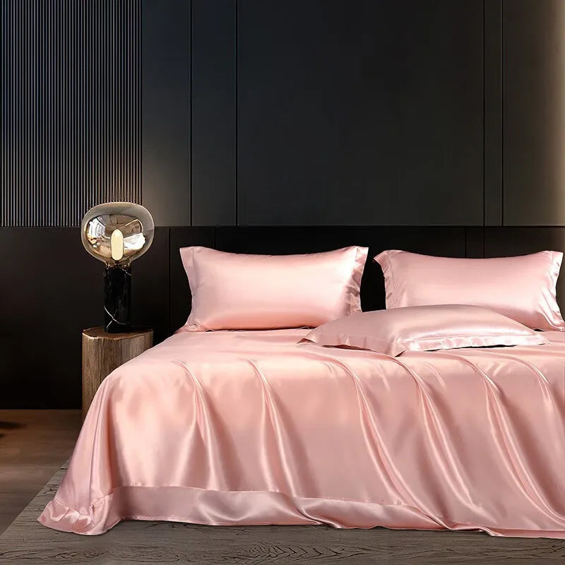
Before comparing bedding colours, confirm that you are looking at the same product and exact variant. Then distinguish the source photograph from the screen and viewing conditions used to see it. Those checks help explain uncertainty without excusing an image that actually shows the wrong pattern or option.
This guide is about reading product photography, not matching manufacturing batches or measuring a delivered textile. It offers a practical way to ask clearer colour questions before buying. An online image is useful appearance information, but it should not be presented as a guarantee that every screen and room will show an identical shade.
Identify the selected option first
A product page can contain photographs of several colours. Read the selector, the image caption where available and the exact option in the link. Do not compare a generic hero photograph with a variant-specific picture as if they necessarily show the same bedding.
Write the selected colour name and component before saving a reference. A screenshot without the selector can be difficult to interpret later. If you are asking the seller a question, include the product link and exact option so the answer refers to the item you mean.
This step is more important than adjusting screen brightness. A display setting cannot correct the fact that one photograph shows another variant. Resolve identity before trying to explain an apparent colour difference.
Separate the image file from its appearance
Adobe's colour-management explanation, updated in September 2026, notes that the same image can appear differently across devices. Monitor characteristics, calibration, ambient light and software interpretation can contribute. That is a technical reason for caution, not a claim that any discrepancy should be ignored.
Ask two different questions: “Is this the correct source image?” and “How does it appear under these viewing conditions?” A confirmed source file answers the first question. It does not independently verify the delivered fabric under your bedroom lighting.
Equally, possible display variation does not justify substituting an invented pattern or another product. Honest presentation needs both correct item identity and a clear boundary around what a photograph can show.
Use a stable viewing comparison
When comparing two website images, view them on the same device and in the same ordinary viewing situation where possible. This does not turn the screen into a calibrated colour reference. It simply avoids changing several factors while trying to decide whether the pictures themselves differ.
Keep the original page open rather than relying only on a compressed screenshot forwarded through several messages. Compare the exact selected option with the other reference, then note the specific difference you see. “The blue area looks greener here” is a more useful question than “the whole thing is wrong”.
Do not keep adjusting a picture until it matches the colour you hope to receive. Editing a reference changes the evidence rather than clarifying it. Ask the seller for an appropriate unaltered exact-option view.
Check whether the photographs answer different questions
A whole-bed image shows overall arrangement. A close detail shows a smaller part of the surface. A photograph of folded bedding may reveal a different section of a large pattern than a duvet spread across a bed. Those views can be useful together without being interchangeable.
Identify what each image actually establishes. Does it show the exact pattern, a component's shape, a closure or the coordinated room? Do not infer every missing detail from the most attractive frame.
If the available images are only lifestyle views, ask whether a closer exact-option photograph is available. That is a request for useful information, not proof that the product is defective or that a different photograph must be more truthful.
Read highlights and folds cautiously
A fabric photograph can contain bright highlights, darker folds and several areas that look unlike a flat colour swatch. Do not choose one bright patch as the definitive shade of the whole item. Look at the broader pattern and ask which part of the selected textile the image represents.
This is especially relevant when a design combines several colours. A name such as pink-and-blue does not mean every part should look uniformly pink or blue. The position of a fold may make one section more prominent in a particular view.
However, a materially different motif or rearranged pattern should not be explained away merely as lighting. Keep pattern identity separate from shade appearance. If the butterflies, stripes or other design elements have changed, ask whether the image still represents the exact option.
Daylilt's Blush & Aqua reference
The Soft Horizon Blush & Aqua option, checked on 17 October 2026, has an existing website photograph showing its particular multi-coloured printed bedding. The image accompanying this article uses that exact existing source, without recolouring or regenerating the bedding.
That source choice preserves the website reference rather than replacing it with a newly imagined pink-and-blue bed. It does not certify the delivered textile's appearance under every light or on every display. Both statements can be true at once.
If you are comparing an advertisement with the product page, look for the same option and pattern. A general “inspired by” image should not be silently treated as an exact product representation. The selected product's own reference is the appropriate starting point.
Do not infer material from shine
A glossy appearance in a photograph does not identify fibre composition. Read the exact product information rather than translating every smooth highlight into “pure silk”. A photograph is not a substitute for the composition line.
Similarly, do not infer softness, durability, cooling performance or a sleep outcome solely from how the bedding looks. A well-lit image can illustrate appearance without proving those claims. Ask for specific evidence if a particular performance statement matters to your choice.
Keep the questions separate: the correct colour and pattern, the actual material description, the component measurements and the care requirements. Confirming one does not automatically confirm all the others.
Ask for the view you actually need
Instead of asking for “a better picture”, explain the uncertainty. You might need the exact variant laid out more plainly, a close view of the pattern or confirmation that a lifestyle photograph belongs to the selected colour. A precise request is easier to answer.
Do not ask a seller to guarantee that the item will match an unrelated paint sample through two unverified screens. If a close match is essential, ask what practical reference or information the seller can genuinely provide. Do not assume a swatch service exists unless it is confirmed.
If the available evidence is insufficient for a colour-critical decision, waiting or choosing a deliberate contrast may be more sensible than pretending the uncertainty has disappeared. A purchase does not become necessary because you have spent time comparing images.
Keep room inspiration separate from the product reference
A styled bedroom can make a bedding option easier to imagine. Yet its walls, lamps, furniture and decorative layers may not resemble your room or be included in the purchase. Decide which parts of the image are inspiration and which parts identify the product.
Do not expect the room's entire atmosphere to arrive in the parcel. Check the exact selected contents and use your own room's fixed features when deciding whether you like the combination. The bedding may work differently without the same headboard, curtains or staging.
This guide does not tell you which palette to choose. It helps keep an appearance decision grounded in the actual item rather than the complete photograph surrounding it.
A fictional exact-variant check
Imagine a shopper saving a generic collection image and then selecting another colour on the product page. In this illustrative example, the two views appear different because they refer to different options. The shopper first checks the selector and asks the seller which image belongs to the chosen variant.
Only after that identity question is settled do they compare the appearance. They do not change display settings repeatedly in an attempt to make two different options match. The useful result is a correct reference, not a theory about lighting.
If the seller cannot confirm which image is relevant, the shopper leaves the question unresolved. They do not use the most appealing picture as if it had been verified.
A fictional screen comparison
A second shopper sees the same source photograph on two devices and notices a different impression of the blue. This does not, by itself, establish that the product or listing changed. They compare the same current page on one device and describe the remaining uncertainty to the seller.
They do not conclude that one screen must be accurate merely because it is newer or more expensive. Nor do they assume both are useless. Each view is part of the practical information available, with known limitations.
If exact matching is essential, they ask about an appropriate reference and current terms before ordering. They keep the decision proportionate rather than buying display hardware solely to choose one bedding set.
A concise colour question card
- Item: exact product, selected variant and component.
- Reference: current product image or link, not an unlabeled screenshot.
- Difference: the particular colour area, motif or detail that looks inconsistent.
- Comparison: same source and viewing setup, or several changing factors?
- Needed answer: correct image identity, another view or a specific product clarification.
The card helps distinguish a listing question from a display question. Keep both visible if both remain uncertain. You do not need to assign fault before asking for information.
What not to do with a screenshot
Do not sample a pixel and treat its digital value as the complete specification of a physical textile. It identifies a point in that displayed image workflow, not the material's guaranteed appearance in every room. Nor should an edited screenshot become the reference against which the seller is expected to fulfil the order.
Avoid cropping away the product selector or the part that explains the option. If you share the screenshot for help, include enough context to identify the item without exposing account, payment or unrelated personal information.
Keep the original link alongside it. A screenshot is useful for describing what you saw at a particular moment; the current product page remains important for checking the selection and available information.
When a parcel later raises a question
If the delivered item appears inconsistent with the selected option, describe the concern factually and contact the seller through its appropriate process. Keep the exact order and variant details. Do not alter or launder the item simply to test a theory before asking what inspection is appropriate.
This article does not decide whether a difference is acceptable or establish a return outcome. It helps make the earlier reference clear enough that a later conversation is about the actual chosen item rather than a remembered advertisement.
A correct source image, accurate option label and honest uncertainty are useful at both stages of the purchase. They are not replaced by a general disclaimer that colours vary.
Check which component carries the pattern
For a set, ask about the cover, sheet and pillowcases separately if the image leaves their appearance unclear. A coordinated set need not mean that every surface displays the same part of the print. Do not assume a patterned cover establishes the appearance of a sheet hidden beneath it.
In a fictional enquiry, a shopper likes the visible duvet but cannot see the fitted sheet clearly. They ask for the selected set's component description instead of enlarging a small exposed corner until it becomes unreadable. This is a contents-and-appearance question the seller can address directly, and it avoids building the whole choice on a detail the photograph never showed well.
Choose with clear expectations
Confirm identity first, compare the relevant views and ask a precise question where appearance remains unclear. Recognise display limitations without allowing them to excuse a wrong product image. Keep material, fit, care and performance claims separate from the colour discussion.
Daylilt's existing exact-option photographs are the starting references for its products. Use them as useful evidence of the intended appearance, while keeping the distinction between a digital picture and the textile in your own room honest.



Leave a comment
This site is protected by hCaptcha and the hCaptcha Privacy Policy and Terms of Service apply.