


To coordinate printed bedding, choose one existing room colour to connect with the print, let the bedding be the main pattern, and keep the surrounding layers simple. Check the exact named product variant before ordering; a range's first gallery image may show a different colour.
You do not need to repaint the room or replace every accessory to make a patterned bed look considered. A duvet cover and matching pillowcases already occupy a large visual area. The most useful styling decisions are often the things you leave alone: a neutral wall, a plain curtain or a familiar bedside table. This guide shows how to choose around your real room rather than trying to reproduce an entire staged photograph.
Take stock of the colours that are staying
Start with the fixed elements: walls, flooring, headboard, curtains and larger furniture. Write down their broad colours and whether they appear warm, cool or neutral to you in that room. You do not need technical paint terminology. “Warm cream wall, dark headboard, pale floor” is enough to identify the background against which a print will sit.
Look at the room at the times you use it. Morning daylight and evening lamps can make the same surface appear different. Notice which existing combinations you already enjoy. If you dislike how two fixed colours sit together, a new duvet cover may not resolve that on its own. Choose a print that works with the room you have, not a hoped-for future version of it.
Separate the things you might change from those you will definitely keep. A small cushion cover is a different commitment from new curtains. This avoids buying bedding around an accessory you could easily remove while ignoring the dominant headboard or flooring. It also helps keep the project contained instead of turning one purchase into a full-room shopping list.
Choose a lead colour, not a perfect match for everything
Find one colour in the print that can connect with something already in the room. It might echo a cool curtain, soften a dark headboard or sit alongside a warm neutral wall. The connection does not need to be an exact match. A room can feel coherent through related tones and balanced contrasts without every fabric sharing the same shade.
Trying to match every colour usually creates unnecessary work. A multicoloured print may contain small accents that are best left as accents. Choose a lead colour for the larger supporting pieces, then let the remaining colours stay within the bedding. This gives the eye a clear place to rest rather than introducing a new decorative object for every hue.
If you are uncertain, compare two possible directions using things you already own. Put a plain neutral throw beside the product image, then try an existing coloured cushion. Treat the exercise as a preference check, not a guarantee of an exact colour match. A screen cannot establish how a physical fabric will look under your own lighting.
Use the exact variant photograph

Product galleries often combine a hero image, close-ups and several colour options. Before saving an inspiration picture, check which variant it represents. A colour name is a useful identifier, but it is not a standard paint specification. Two products called “blush” may look different, and a lifestyle image may show another option from the same range.
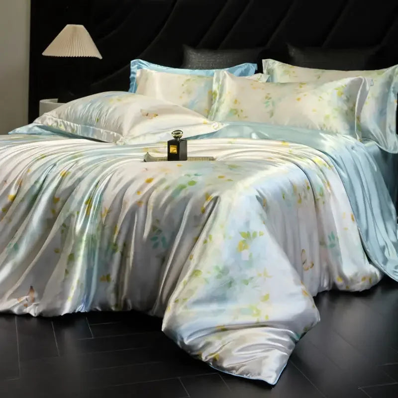
Daylilt's Soft Horizon Blush & Aqua option should be considered using its associated product photograph and complete selected size. Do not substitute a generic pink-and-blue bed when deciding whether you like the pattern. The placement of colour washes and motifs is part of the visual choice, not just the two words in the variant name.
Keep a note of the full product and variant name once you decide. If you change the size selector, check the colour again before adding to basket. Likewise, if you share the idea with someone else, send the specific product link and name rather than only a cropped image. This makes the decision clearer and reduces accidental selection of a neighbouring colour.
Let the bed carry the main pattern
A large printed duvet can act as the room's visual focus. Plain surrounding fabrics make that focus easier to read. This does not mean the room must be minimal or colourless; it means you decide which pattern takes the lead. A quiet wall and simple curtain can allow a multicoloured set to feel intentional rather than competing for attention.
If you already have patterned curtains or wallpaper, compare the scale and density of those patterns with the proposed bedding. Two equally busy patterns can feel energetic; that may be what you want, but it should be a deliberate choice. If the room already feels crowded to you, a plainer bedding option or fewer additional patterned accessories may be more satisfying.
Do not buy a full set of new decorative cushions before seeing the bedding in your own room. Start with the coordinated pieces and live with the combination briefly. You may find the print supplies all the detail you wanted. Accessories can then solve a specific visual gap instead of becoming a second collection of competing patterns.
Balance the large colour areas
Consider the bed as a group of surfaces rather than a single flat rectangle. The duvet occupies the largest area, the pillows sit at eye level, and the fitted sheet may show at the sides or foot. A reversible-looking photograph does not prove that both sides have the same pattern or composition; confirm the product details if that matters to your styling plan.
Plain layers can break up a strong print. A familiar neutral throw folded across the foot may make the colour arrangement feel calmer to you. Alternatively, leaving the duvet unobstructed may show the design more clearly. Neither is a rule. Choose the arrangement that you enjoy and that remains practical to make each morning.
Check whether a supporting colour appears in a substantial area of the print or only in a small detail. Using a tiny accent for a very large new curtain can change the balance dramatically. Try smaller, reversible adjustments first. This keeps the bedding as the focus while allowing you to discover how much contrast you actually want.
Texture can do work without adding another pattern
Different surface finishes can create interest even when the colours are restrained. A plain woven throw, a simple wooden bedside table or a fabric headboard may provide enough contrast beside a lustrous bedding surface. You do not need to imitate the finish of every item. Think about how the surfaces look together, while keeping comfort and care practical.
A shiny appearance does not tell you the fibre composition. Silk is a fibre; satin describes a weave, and satin fabrics can use different fibres. Daylilt has separate silk, silk-blend and satin listings. Choose the material and care requirements from the exact product information rather than assuming that a glossy photo means pure silk.
The current Soft Horizon page describes a silk and Lyocell blend, while the current Moonlit page describes rayon with a satin weave. Those are product-page descriptions, not laboratory verification performed for this article. Styling advice should not turn them into unsupported claims about skin, hair, sleep quality or temperature performance. The visual finish and the evidenced material information are separate considerations.
Three room scenarios to try
A light room with warm neutrals
If your room has cream walls and pale wood, begin by comparing a print's warmer areas with that background. You might prefer a gentle connection through pink, cream or another warm tone. Keep an existing plain layer while deciding. These are illustrative combinations, not a statement that one named Daylilt colour will match every cream paint or wood finish.
A dark headboard with simple walls
A darker headboard can frame a lighter print. Check whether the pillow arrangement leaves enough of the headboard visible for the balance you like. A plain bedside surface can keep attention on the bedding. You do not need decorative objects on the bed itself; a clear sleeping surface often makes both the pattern and the daily routine easier to appreciate.
A room with an existing cool accent
If blue or green already appears in curtains or artwork, look for a connection rather than chasing an exact screen match. The aqua element of a multicoloured print may be a starting point for comparison, but judge the complete photograph. A print with warm and cool areas can look quite different from a single-colour swatch described by the same name.
Check the bed size before finishing the look
Good coordination still needs a usable set. Measure the mattress width, length and depth, then the duvet and pillows. Compare those measurements with the exact option rather than choosing only by a familiar bed label. The visual effect of a duvet that is too small or a fitted sheet that will not stay in place cannot be solved by matching accessories.
The current Soft Horizon description lists one duvet cover, one fitted sheet and two matching pillowcases in every option. It lists the pillowcases as 48 × 74 cm. Confirm the rest of the selected dimensions on the product page and ask about any missing fit detail. A complete four-piece description does not mean every option fits every mattress and duvet combination.
Our bedding-measurement checklist is simple: record each item separately, compare the exact centimetres, and resolve missing dimensions before ordering. Keep those practical notes alongside your colour choice. This gives you two independent reasons for the decision: the set suits the room visually, and the individual pieces suit the items you own.
Make a small, useful mood board
A mood board does not need specialist software. Put the exact product photograph beside one photo of your own room and two or three existing colours or surfaces you plan to keep. Label the selected variant. Avoid adding dozens of aspirational images, because that can hide the actual decision beneath unrelated lighting, furniture and photography styles.
Write one sentence about the result you want: “The print is the focus, with plain supporting layers,” or “I want the bed to connect the cool curtain with the warmer wall.” This gives you a way to judge the options. If a proposed accessory does not help that sentence, you probably do not need to buy it for this project.
Keep screen limits in mind. A mood board helps compare relationships, not certify physical colour accuracy. If an exact match is essential, ask whether reliable additional colour information or a sample is available. Do not assume either service exists. It is better to leave a decision open than to treat a digitally edited image as a fabric sample.
Build a room you can use every day
Think about how many layers you want to move at bedtime and replace in the morning. A carefully styled photograph may include several decorative pieces that are inconvenient in daily use. Choose the number that suits your routine. There is nothing incomplete about a coordinated duvet and two pillows if that is the arrangement you enjoy.
Care matters as well. Read the supplied instructions for every piece, particularly when mixing materials. A throw and a duvet cover may need different washing methods. Keep the product information accessible, and do not assume a matching visual finish means matching laundry requirements. A simpler arrangement can be easier to maintain without making the room less considered.
When the bedding arrives, compare its labels and selected variant with your order before washing or use. Assess the colour in your normal room lighting rather than expecting it to reproduce a screen exactly. If the product or contents differ from the order, contact the retailer using the current support and returns guidance rather than trying to disguise the mismatch with more accessories.
Your printed-bedding decision checklist
- Identify the fixed room colours and the elements you will keep.
- Choose one lead colour connection rather than matching every accent.
- Use the exact variant photograph, not a generic colour substitute.
- Decide which pattern is the focus and simplify competing layers.
- Check material and care information separately from the visual finish.
- Measure every piece before selecting the size.
- Start with existing accessories and add only what serves a clear purpose.
A coordinated room does not need everything to match. Start with the Soft Horizon Blush & Aqua product photograph, compare it with the room you already have, and check the complete option's dimensions and contents. Let the bedding bring the detail, keep the surrounding choices useful, and build a look that feels as good in everyday use as it does in a saved image.


Leave a comment
This site is protected by hCaptcha and the hCaptcha Privacy Policy and Terms of Service apply.