

Cotton percale and cotton sateen describe different woven constructions, not two grades on a single quality ladder. Percale is associated with a plainer, slightly crisp character; sateen with a smoother-looking, more lustrous face. The useful choice depends on the exact cloth and the feel and appearance you prefer, not on declaring one universally superior.
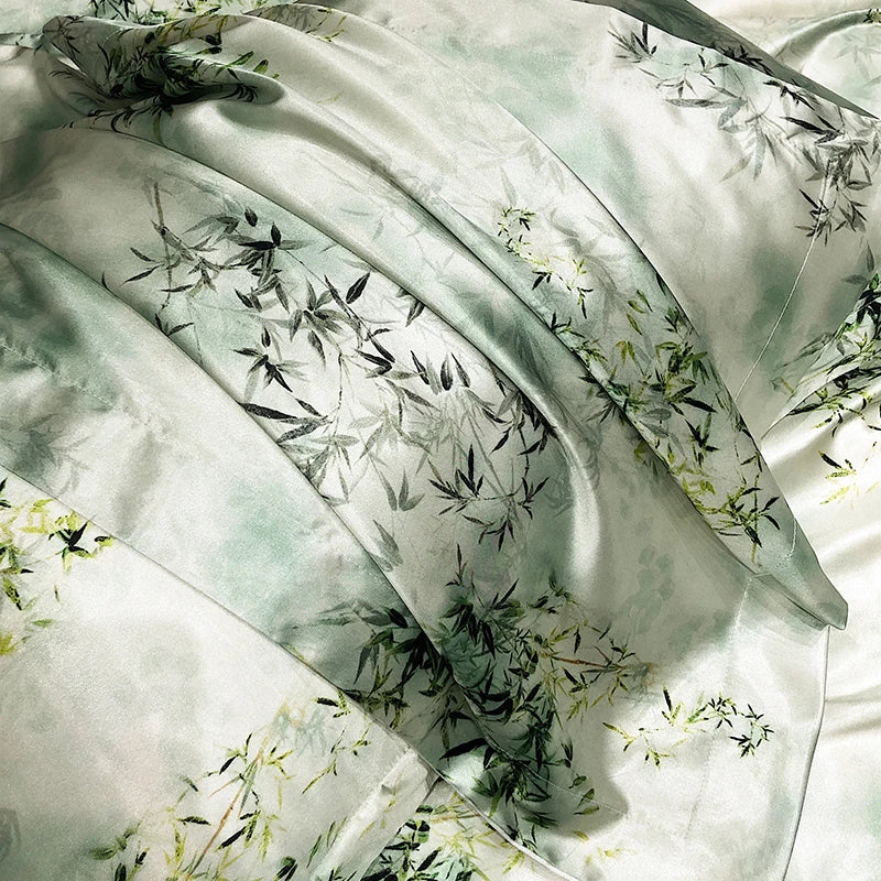
Daylilt's existing bedroom image used here shows Moonlit rayon satin. It is not a cotton percale or cotton sateen sample, and this article does not announce either material in the current catalogue. The image illustrates a glossy bedroom look only. Read the composition of any actual product separately from the visual impression it creates.
Two names, two different kinds of information
In cotton percale, cotton identifies the fibre and percale describes the fabric construction. In cotton sateen, the same fibre word appears beside a different construction term. Keeping those parts separate helps you understand why two cotton products need not look or feel identical. It also prevents a weave name being mistaken for proof of silk content.
CottonWorks' percale entry describes a smooth, slightly crisp plain-woven fabric. Its sateen entry describes a smooth, lustrous face and distinguishes the construction from silk fibre. CottonWorks is a cotton-industry education and promotion resource. These definitions help with terminology; they do not establish that every finished product sharing a name has identical performance.
The practical next question is therefore not “Which word sounds more expensive?” It is “What is the exact item made from, how is it described and does that character suit me?” You can prefer a simpler-looking face or a glossier one without needing a scientific reason for the preference. Accuracy begins by naming the choice honestly.
What plain weave adds to the explanation
CottonWorks' woven-design guide explains plain weave as alternating over-and-under interlacing in the two yarn directions. That basic description is more informative than calling a percale sheet hotel quality. It tells you something about the construction, while the hotel phrase tells you little unless a retailer defines what it means.
You do not need to memorise a weaving diagram to shop sensibly. Use the construction term as a way to ask for comparable information. If a listing uses percale without stating the fibre composition, do not assume the missing percentage. If it claims a particular finish, ask whether that description refers to the selected item.
A photograph of a neatly made bed cannot verify the weave for you. The visible surface may be affected by lighting, preparation and image resolution. Treat the image as appearance information and the supplier's specification as construction information. They support different parts of the decision rather than substituting for one another.
What lustre adds—and what it does not
A more lustrous face may appeal because it changes how the bed looks in the room. That is a visual preference, not evidence that the fibre is silk or that the product will produce a particular health outcome. Keep those questions separate. A smooth-looking fabric can belong to different material categories.
Look at the exact product image in the context of your actual bedroom. A glossier surface may become a stronger visual feature beside a patterned curtain or dark headboard. You may enjoy that or prefer a quieter contrast. These are design proposals to consider, not rules that every room or person must follow.
If a colour match matters, remember that a screen cannot certify physical colour or shine. Ask what additional reliable information is available. Do not recolour a product photograph to create the version you wish existed and then order expecting that image. The selected product and the mood board need to remain connected.
Be specific about the word soft
Soft may mean a smooth surface to one person, a flexible drape to another or a familiar worn-in feel to someone else. When comparing reviews or retailer language, ask which meaning is being used. You are more likely to make a useful decision when you can describe your own preference in concrete terms.
Use bedding you already own as a personal reference without inventing its specification. You can say “I like how this surface feels against my hand” even if you do not know its exact weave. If the label is available, record it. If it is not, do not turn a guess into a technical comparison.
Where a genuine sample is offered, check that it represents the actual current fabric. Handle it according to the seller's guidance and consider the relevant return terms before washing or altering anything. A sample can help with preference, but it is not a clinical test or a guarantee that every piece will feel identical in use.
Keep the thread-count discussion proportionate
Thread count is another construction detail, not a way to collapse the percale-versus-sateen choice into a single number. If you compare figures, establish what each means and whether the unit and method are comparable. Do not assume the larger advertised count answers a question about texture or visual character.
Our thread-count explanation gives worked examples for that narrower issue. Use it when the number is part of your decision, then return to the full product. Material, construction, dimensions, contents and care still need separate consideration.
A useful comparison can contain an unknown. If a retailer cannot clarify a technical term, decide how important that gap is to your choice. You may be satisfied by other confirmed information, or you may choose to wait. Do not invent a specification merely because the shortlist would look tidier with every box filled.
Do not transfer care instructions between fabrics
The exact finished item's label should guide its care. Cotton in the name does not authorise one universal wash temperature, drying method or ironing setting for every product. Colour, trim and finishing may matter. Keep the instructions attached to the product identity rather than relying on a memory that another cotton sheet was easy to clean.
Compare the care requirement with the household routine before buying. If the item needs a process you cannot realistically provide, that is a practical mismatch even when the appearance appeals. Ask the person who usually handles the bedding what is manageable. A purchase should not quietly assign them a different maintenance task.
When information is contradictory, seek clarification before taking an irreversible step. Describe the difference between the label and the listing accurately. Do not blend several instructions into your own experiment or assume a general article overrides the manufacturer. A clear answer is more useful than a new theory about how all sateen or percale behaves.
Compare the whole piece on the bed
A fabric preference does not establish fit. Measure the mattress, duvet and pillows separately and compare the selected piece's exact dimensions. A familiar size name can be a starting point, but it is not a substitute for the centimetres. Keep the desired texture and the physical compatibility as two distinct reasons for the decision.
Check what is included at the advertised price. A photograph of a coordinated bed may show a sheet, cover and several pillowcases while the selected option is only one piece. Compare the actual contents, not the scene. A construction term cannot tell you the number of items in the package.
Openings and closures also remain separate. A fabric you like can still have an opening arrangement that is awkward for the insert you own. Ask about missing details where they matter. Your comparison should describe the task you will perform, not merely the texture you hope to enjoy.
Two illustrative preferences with no universal winner
Imagine one person who likes a less glossy-looking bed and describes their preferred fabric as slightly structured in the hand. They investigate a cotton percale option, asking for the exact composition, dimensions and care. The name helps them form a relevant question; it does not complete the decision for them.
Another person prefers a more lustrous appearance and investigates a cotton sateen option. They ask the same practical questions and look for reliable information about the actual cloth. Neither person needs to claim that their preference is healthier or more luxurious for everyone. Both can make a considered choice for their own room.
These are fictional examples, not Daylilt customer stories or comparative product tests. The useful difference is the brief each person brings to the product. A clear preference gives the technical information a job, rather than letting technical words decide what the person is supposed to like.
Do not let one pleasant impression become a broad claim
After using a product, you may have a valid personal opinion about its feel or appearance. Keep that opinion specific when sharing it. “I like this surface” is different from “this weave gives everyone better sleep.” The second statement needs evidence that an ordinary purchase experience does not establish.
If your experience changes, describe the actual change and follow the appropriate care or support process. Do not assume every surface issue proves something about the entire material category. The exact item, use and instructions matter. A concern deserves a factual description rather than a universal verdict based on one piece.
For health or persistent sleep concerns, seek appropriate professional advice. Fabric education can clarify a shopping question; it cannot diagnose why someone sleeps poorly. You do not need to buy through every weave category before asking for help, and a new sheet should not be presented as a replacement for that support.
Where Daylilt's current materials fit
The Moonlit Satin Four-Piece Bedding Set is currently described as rayon with a satin weave. It should not be relabelled cotton sateen to make this article more directly commercial. The accurate link is a different material option whose appearance may help you understand your preference for a glossy finish.
Daylilt's silk and silk-blend descriptions likewise need their own composition checks. Do not transfer an explanation about cotton construction into an assumption about another product. A brand can discuss materials it does not currently stock, provided it makes that boundary visible rather than using the educational article to blur it.
If you are specifically looking for cotton percale or cotton sateen, use the retailer's exact product information and ask about any missing composition or construction detail. Do not order a different fibre because its picture appears similar. Appearance can connect styles without making the underlying materials interchangeable.
Pattern and construction are different decisions too
Percale does not mean that a fabric must be plain-coloured: CottonWorks' definition includes printed or dyed examples. Keep the decorative pattern separate from the weave when comparing a listing. A floral print does not establish a particular fibre, and a plain white sheet does not identify the construction by appearance alone.
This gives you a more useful design brief. You might want a particular surface character and a small print, or the same surface character in a solid colour. Ask whether the actual product provides both. Do not buy one requirement while assuming the other because a photograph resembles something you have seen elsewhere.
For a physical comparison, use a short vocabulary you understand: surface, movement and appearance. Surface is your impression when touching the cloth; movement is how the sample behaves in your hands; appearance is what you see under your normal room lighting. These are personal observations, not laboratory results. Recording them separately makes your preference more precise than giving every sample the same word soft.
Keep the sample's identity beside those notes. If several pieces are laid out together, it is easy to remember a preferred impression while losing track of which exact fabric produced it. A small label and an unchanged reference photograph can prevent that practical mix-up.
A useful fabric preference note
- What do I mean by the feel I want?
- Do I prefer a plainer-looking or more lustrous face?
- Is the exact fibre composition confirmed?
- Is the construction term supported by the product information?
- Are dimensions, contents and openings suitable for what I own?
- Can the household follow the finished item's care instructions?
- Which uncertainty still needs an answer before ordering?
Percale and sateen are useful words when they make the comparison clearer, not when they create a compulsory ranking. Learn the construction difference, describe your own preference and check the exact product. The better choice is the one that answers your actual brief with accurate information.


Leave a comment
This site is protected by hCaptcha and the hCaptcha Privacy Policy and Terms of Service apply.